So much more than the little white reader.
From building teams to platform rebrands, so far my time at Square has been action-packed. My assignment, as Group Creative Director for the Square Platform includes heading a multidisciplinary team of creatives, technologists and product marketers working to build remarkable campaigns to expand adoption of the Square Platform among developers, partners and sellers.
The Square Platform includes exciting 1st party solutions, as well as a wide portfolio of 3rd party apps that make Square one of the most powerful commerce tools in the world, allowing our customers to customize the solutions they need to power their business. But often our target audience does not understand the power of working with us. Whereas you’re a developer looking to launch an app on the Square App Marketplace, or a large seller looking to build a custom integration, the messaging and value proposition used to be segmented, unclear and uninspiring.
First notional sketches.
Sketched photography treatment
To solve this, my team was tasked with a rebrand of the Square developer platform, with the main objective of clearly illustrating ‘what’s in it’ for our partner audiences. The solution? A brand identity that captures the attention of everyone from upmarket decision-makers to indie engineers.
Inspired by the two hemispheres of the 🧠 , this brand talks in two modes…
Left Brain
Precise, premium and technical. It positions Square as an enterprise-grade platform by extending the Square brand system.
Right brain
Playful, lo-fi and offbeat. It gives Square an irreverent point of view unlike anything else.
The work comes to live in every single touchpoint — from marketing materials to in-product and documentation. And even code and programming.
The first public example of the newly designed brand saw the light in the form of a new Developer and Partner public web ecosystem.
The “Devicons” are a series of purposefully-designed icons representing various use cases that Developers and Partners can replicate on the Square platform.
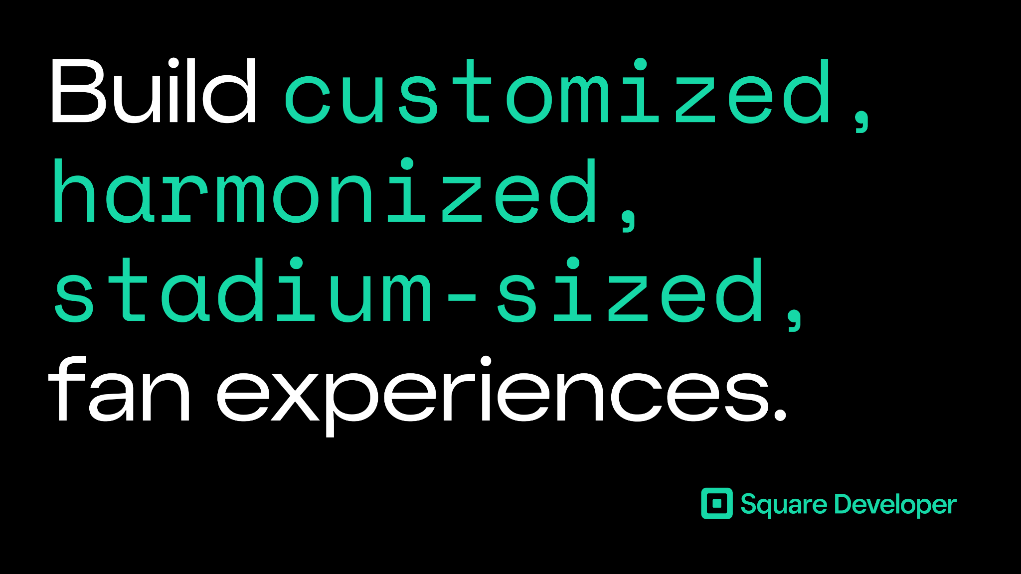
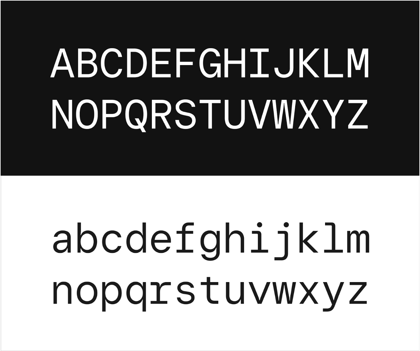
Square Mono is a font family extension we developed for this rebrand, inspired by code and how Developers use typography. It’s an important part of this work, and a great addition to the Square font family.
Role: Executive Creative Director, project “unblocker”, strategy generator, design director
Team:
Lauren Schonzeit — Creative Director
Rene Malki and Olivia Gericke — Project Manager
Kiran Puri — Art Director
Kate Catinella — Copywriter
Erika Liberato — Interactive Designer
Chris Mah — Studio Lead
Chris Woodward — Design Technologist
Johnnie Tran — Production Designer
Alex Jacque — Design Lead, Developer Platform
Font design by Colophon Foundry


